

Hot Dogs, Strawberry Cola Floats, and Rose Cardamom S'mores: Whimsy Dispatch #7
A brief history of hot dog cart design in New York, printable word searches and name cards for your hosting today, and recipes for smash burgers, strawberry cola floats, and rose cardamom s'mores!


Every Friday, I send out a Whimsy Dispatch to supporting subscribers of Feeling! Magazine. It is a long-form, in-depth companion to becoming the creative director of your home and life, and a big piece of my heart. I believe there is so much to be hopeful about, and I try weekly to provide helpful tips to curate joy in your life and home. It is filled with inspiration, colors, themes, home café recipes, dinner recipes, and other whimsical musings for your week ahead.
This week is an extra special holiday edition of the Whimsy Dispatch, featuring:
- A Brief History of Hot Dog Cart Designs in New York City
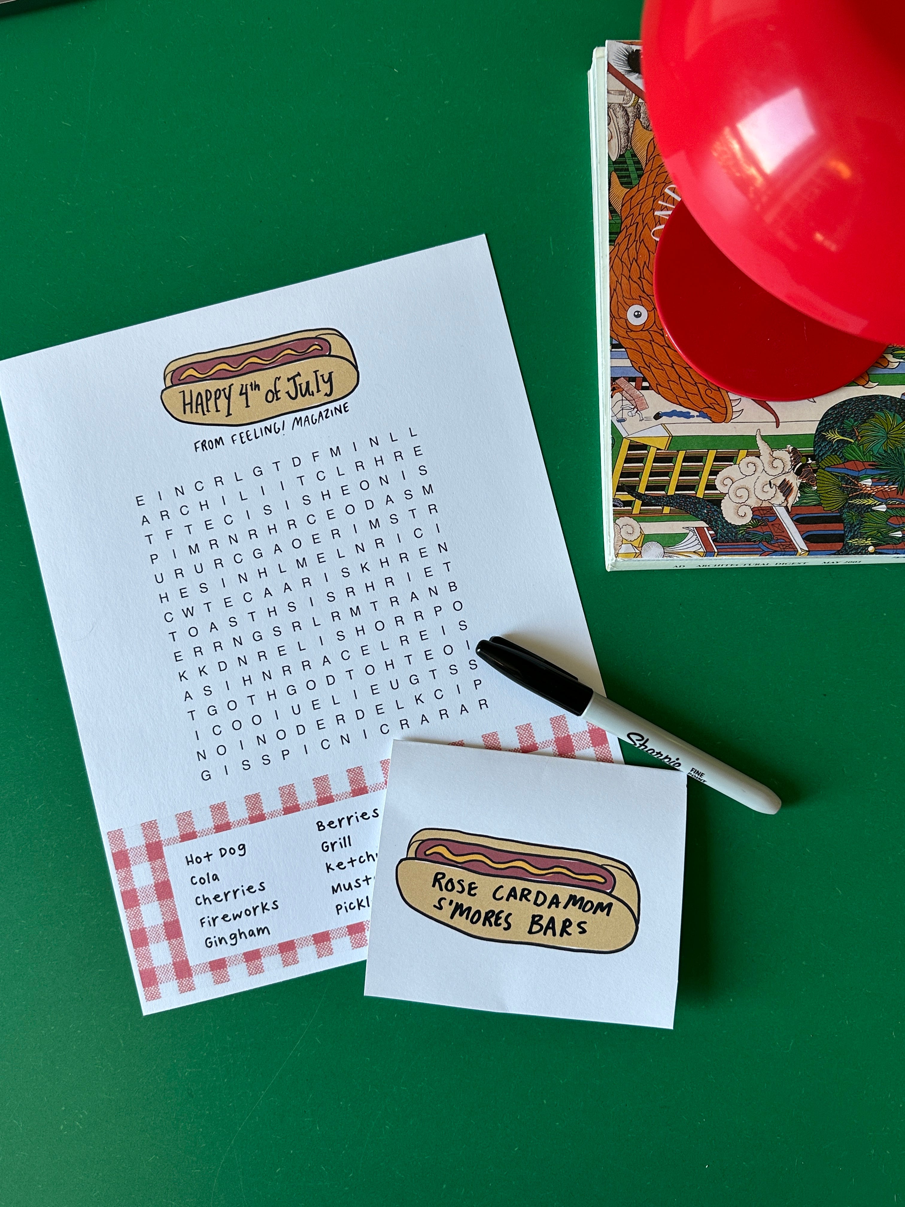
- Hand-illustrated printable hot dog namecards
- Printable themed word search for your hosting (or bringing to a party!)
- My recipe for homemade smashburgers
- My recipe for strawberry cola floats
- My recipe for cardamom rose s’mores bars
Don’t forget the Feeling! Magazine’s companion, my brand new YouTube channel! It’s a new adventure (this is episode two!), and I hope you love it. It’s a pretty cinematic (thanks to my husband, who is actually a documentary filmmaker) weekly vlog, with lots of cooking, living life with friends, exploring the city, and making my home my favorite space to be.
As a dear reader commented, “Looooovee it!!! Your Substack, but in imagery!”
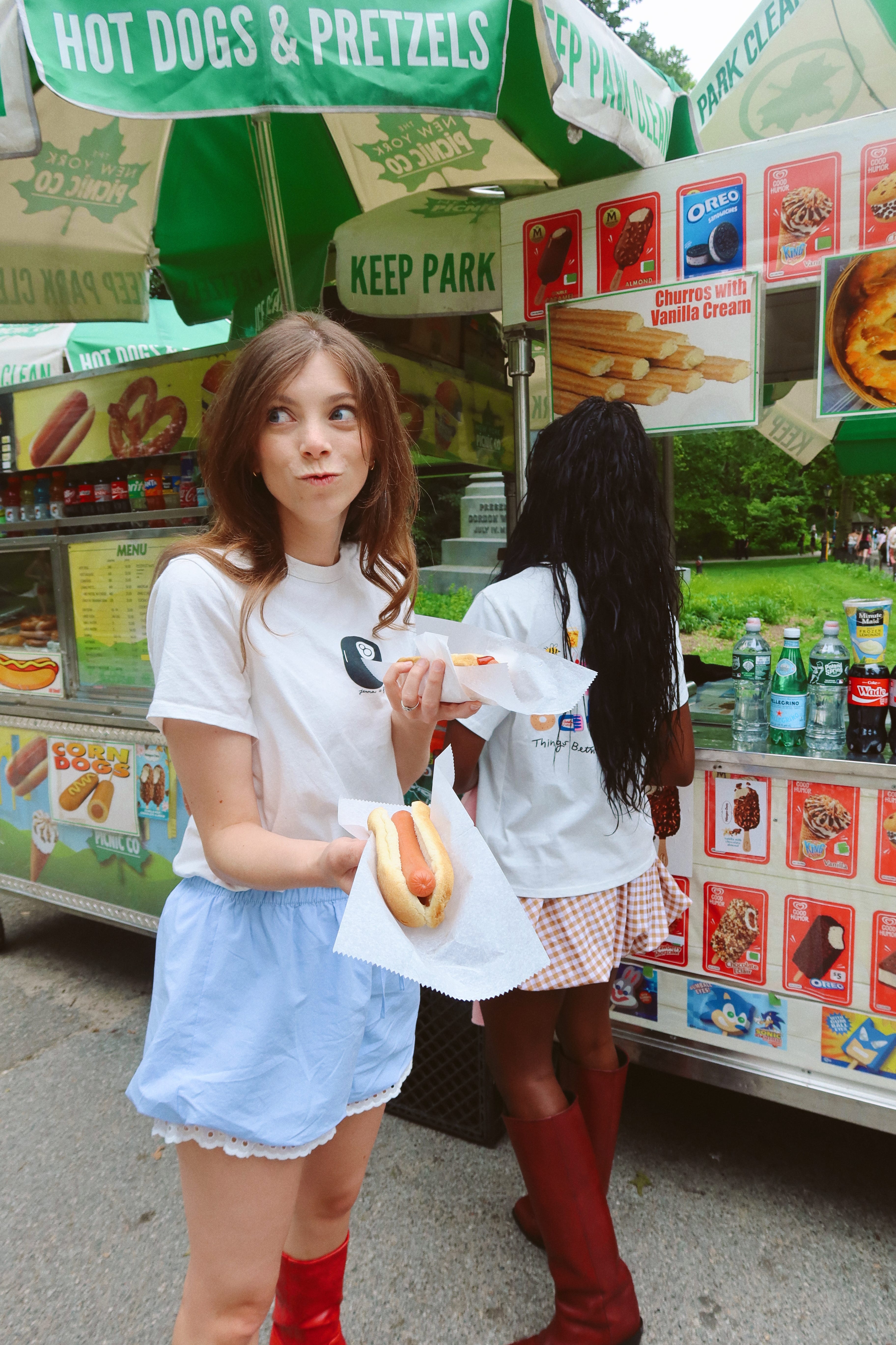
A Brief History of Hot Dog Cart Design in New York City

Few foods capture Americana design, specifically that retro-glowing-New-York-City-feeling, better than the hot dog. Hot dogs are fascinating to me because they evoke some sense of nostalgia in their design and marketing in a way that other foods do not dare play into. The brand design of hot dogs generally always looks…vintage?
It’s believed that German immigrants first brought the Frankfurter to New York around the 1890s. By the 1920s and 30s, the colorful branding of the hot dog in New York was already solidified amid street vendors and Coney Island stands. Early hot dog carts were unassuming, but still colorful with hand-painted signs and promises of cheap eats.
A 1936 photograph by Berenice Abbott shows a vendor beside his Tella’s Busy Bee cart advertising “Red Hot Frankfurters” and “Ice Cold Lemonade” for five cents.
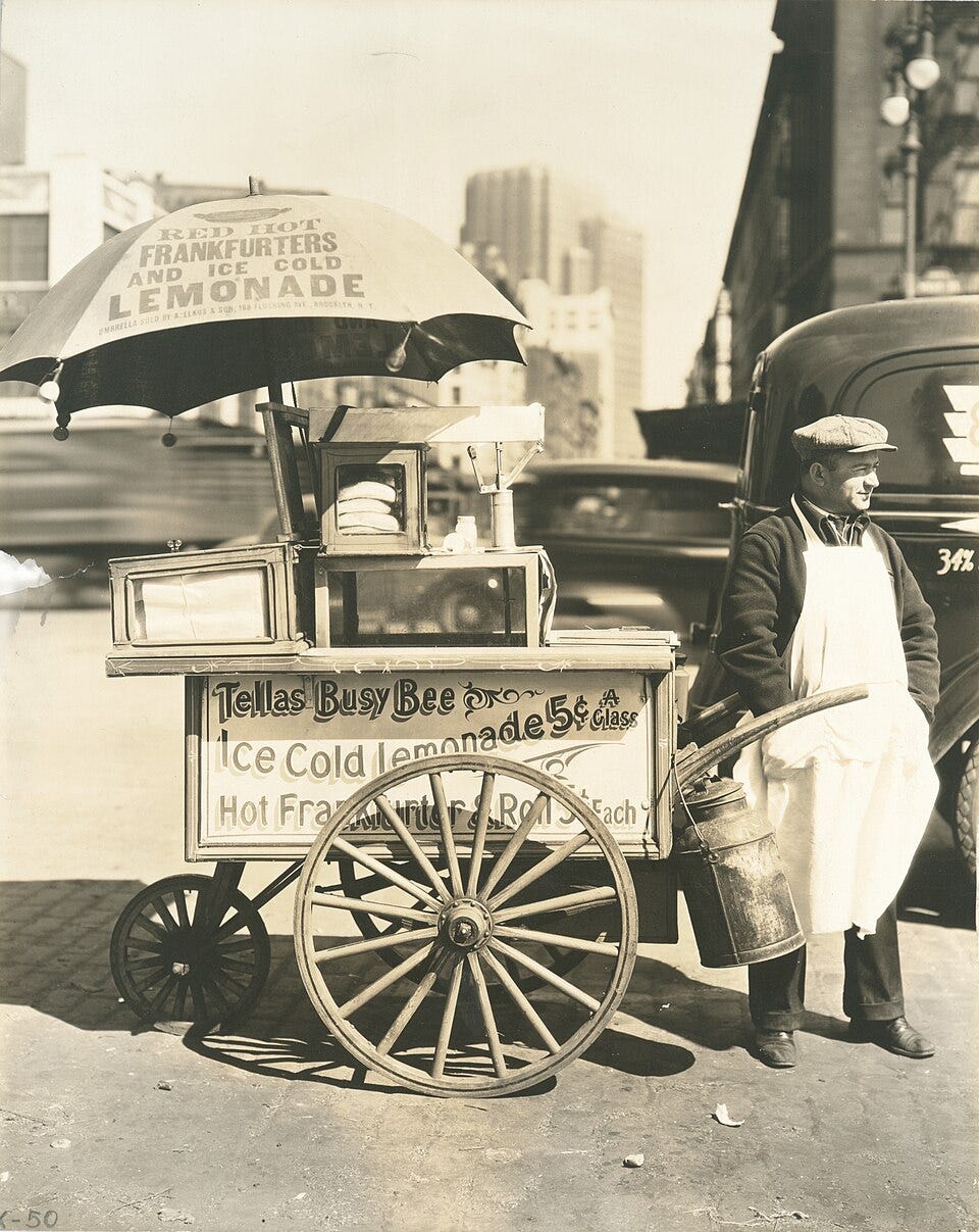
Typography on these carts was straightforward and high-contrast for legibility, often blocky capital letters or carnival-style scripts, evoking the fairground origins of the Coney Island frankfurter.
By summer 1920, New Yorkers were buying 75,000 Nathan’s hot dogs each weekend (mcny.org). Early packaging was minimal, a hot dog handed over in a soft roll or a paper wrap, placing emphasis on the on-cart graphics and signage. This seems to remain the standard practice for hot dogs today: big signs to direct you, but minimal packaging design — usually just tin foil or checkered parchment! (Think: Costco)
This era’s design sensibility was utilitarian, but lively: big painted letters, maybe a mascot dachshund or playful “red hots” nickname, all capturing the novelty of a portable sausage sandwich in a bun.
By the late 1930s and into the 1940s, hot dog branding lit up in neon and went national. The iconic Nathan’s Famous stand in 1930s Coney Island sprouted an enormous green and yellow neon boardwalk sign screaming, “Nathan’s Famous Frankfurters,” a spectacle of early fast-food signage. Glowing signs and eye-catching banners became the standard of mid-century hot dog stands, from Coney Island to midtown Manhattan.

Meanwhile, hot dogs entered supermarkets. Manufacturers began packaging hot dogs for grocery sale around 1940, typically in packs of ten (grubamericana.com).
These mid-century packages featured cheerful, family-friendly designs: primary colors, bold logos, and often quality guarantees (think: happy Oscar Meyer Weiner).
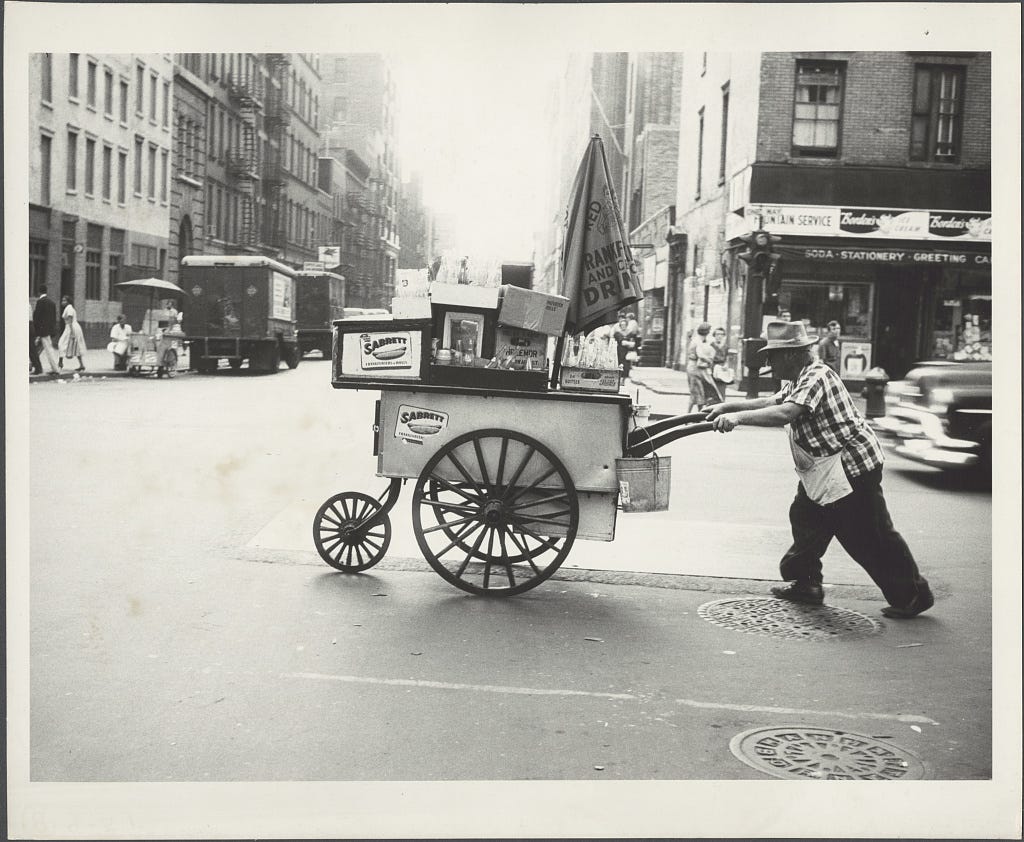
On the New York streets, metal pushcarts started sporting brand decals and standardized umbrellas. By 1957, a photo shows a Manhattan vendor pushing a cart emblazoned with Sabrett stickers – Sabrett being the purveyor of most NYC hot dog carts.
This mid-century period saw hot dog design balancing tradition and modernity: script logos like Nathan’s, intentionally old-fashioned to emphasize heritage, coexisted with streamlined postwar graphics and the glow of neon Americana.
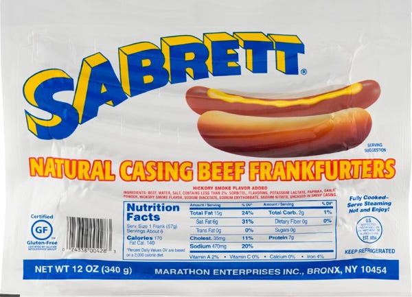
The 1960s and 70s ushered in a bolder, more playful aesthetic in hot dog design, reflecting the era’s pop culture and graphic trends. Nathan’s kept its century-old logo script, and Sabrett introduced its now-famous blue-and-yellow umbrella design.
Typography during this era ranged from funky, curling scripts to thick sans-serifs, often outlined or shadowed for extra punch. Color palettes got brighter: oranges, yellows, and reds that signaled fun and flavor, and stood out on busy city streets. Culturally, by the 70s the hot dog was an American icon, and its branding started to consciously play up nostalgia. Many designs nodded to retro Americana (such as 1890s-style lettering or vintage mascots) even as they embraced contemporary flair.
The hot dog cart itself became a design trope: artists like Andy Warhol even immortalized grocery hot dog labels and street vendors in art, underscoring the hot dog’s quirky place in the visual culture.

By the 1980s, hot dog design had cemented a unique blend of nostalgic authenticity and bold commercial appeal. On the streets of New York, the look of carts standardized into what we now consider classic: shiny steel carts crowned with striped umbrellas shouting “SABRETT”, and colorful price signs. One innovation of this time still lasts on the streets of New York today. Hot dog stands embraced imagery for their menus, incorporating juicy photos rather than just text alone.

Packaging design in the 1980s for hot dogs leaned into clarity and consistency. Major brands unified their pack design: Oscar Mayer, for example, used bold red or orange banners and clear block lettering for product names, a design language so recognizable that it persisted for decades.

The visual evolution of hot dog design from the 1920s through the 1980s tells a story of American cultural identity, from gritty pushcart signs and rustic fonts, through mid-century neon exuberance and supermarket polish, to a mature iconography that still makes a humble hot dog cart feel like a piece of the New York City soul.
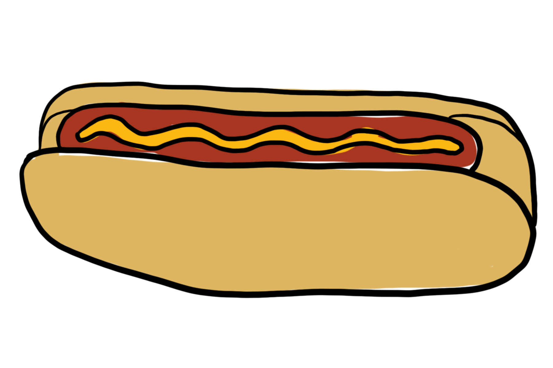
Hand-illustrated Printable Hot Dog Name Cards
If you are hosting today, this will help you add a little magic to your party! You can use them to write names, or he name of your dish!
You can download them here:
You’ll need to do a little cutting and folding!
