

Color Palettes for Everything
Ten color palettes to inspire your next creative project.


This edition of Design Dive is free for everyone because Squarespace sponsored it!

In 2017, I posted a color palette I drew on Instagram from my dorm room, not knowing that it would kickstart a whole career of creativity. It was just me, some watercolors, a Sharpie, and a small burst of creativity.
Throughout the years, my color palettes have spread globally thanks to the internet. I’ve sold them on greeting cards, art prints, painted them on big walls, and in one flashing moment — even witnessed Jennifer Garner share my color dots with her followers. That was a thrill.
A significant amount of my work, life, and career revolves around naming colors, which sounds kind of imaginary, but it’s true. Don’t tell writing, but color naming is my favorite creative practice. I found solace in it back in college, and I still do. I’m hoping one day I get recruited to name nail polish or paint colors, but until then, I will continue to create and share my palettes with you.
If you’ve never dabbled in naming colors, I encourage you to fill your journal with colors and name them. Document life, a season, a day, a memory with colors. It’s a joyful way to document.
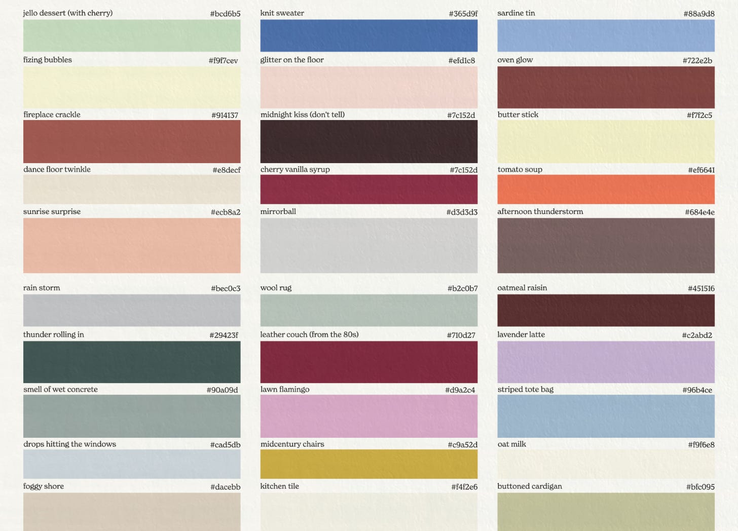
At first glance, these just look like a color graphic with names. But I aim not to name colors after what they look like, but for how they feel. And so I have a process that combines some fiction, some tangible exploring and inspiration walks, and some personal diary entries to accurately depict colors as feelings.
Today, I’ve put together 10 palettes for you as part of a color series. Each palette has a secret story it whispers, and I love that I get to share them with you — mostly because I love to hear how you interpret them.
If a story or memory strikes you while you browse — please share in the comments. I am always fascinated to see what shades creatively strike viewers.

What To Do With a Palette:
Use it for your Substack:
Feel free to use this color inspiration for branding your own Substack page. As the digital space on this platform gets busier, it’s helpful to have a strong visual identity to stand out. Pick your signature colors and use them everywhere to help you tell your own stories.
Use it for your website:
Squarespace has always been my top pick for designing my own website. Back in college, when my creative dreams were just beginning, I created a Squarespace for my business so I could start selling art prints with their e-commerce features. The templates made it easy to start somewhere already beautiful, and then make it look like my own. It’s really nice to have a place online that is not owned by anyone but you — and completely open to your creative ideas with no limitations, by the way. I was going to class during the day, and packing up color dot prints to ship from my website at night! I have always loved how the design features lead the charge — for a visual artist, it’s essential to prioritize the look and feel of my internet space. I use their “styles” feature to choose five colors, and they are automatically incorporated throughout the whole of my website, which makes it easy to upgrade your brand quickly if you are color indecisive (like me).
In this article, I’ve included palettes with five colors, so you can easily plug them into your own site and creative space! Squarespace also offered to take 10% off your website project, just for readers of Feeling! You can click here for a free trial, and when you’re ready to launch, use code “FEELING” to save 10% off your first purchase of a website or domain.
I’m currently dreaming up a new website, but my illustration of Genevieve is the whole home page in the meantime. Use it to draw a picture:
Save the colors, find matches in paints, colored pencils, or pastels — and use the 5 colors to create something new. Think of it like a little art challenge to stay within the palette.
For knitting and quilting:
I frequently get messages from knitters and quilters that they use my palettes to pick yarn and fabrics, which is an absolute delight to know.
For designing a room:
Want to add some color to your space, but feel intimidated by combining bold color? Save a palette and take it shopping to serve as a guide as you look at textiles and patterns.
For your scrapbook page:
If you are a junk journaler or scrapbook enthusiast, use the colors to inspire fresh pages and create direction for your next crafting session.


What is a HEX Code? How do I use it?
Next to each color, you will see a little code behind a #. That is a HEX code. Basically, it is a universal graphic design language that will get you that exact same color every time.
If you are working on your Squarespace site, you can use a specific color’s code to replicate the exact hue so you aren’t guessing!

The Palettes:
Here are 10 curated palettes for your viewing pleasure.
* Again, if one color or palette stands out the most, I would love to know in the comments! I like to study what colors resonate with viewers and why! Plus, I will be gifting some Feeling! subscriptions to some random comments as a little holiday gift!
Kitchen Flow:
This palette is inspired by the flow state in the kitchen — when you’ve got multiple pans on the stove, something in the oven, and you feel extra creative.
For each palette, I sourced some decor images that incorporate the colors into a physical space to show you a practical implementation of the colors.
I love the pop of blue in the tile to balance the warm cabinets.
Big fan of blue sheets — and love the monochromatic yellow frame perched above the bed.
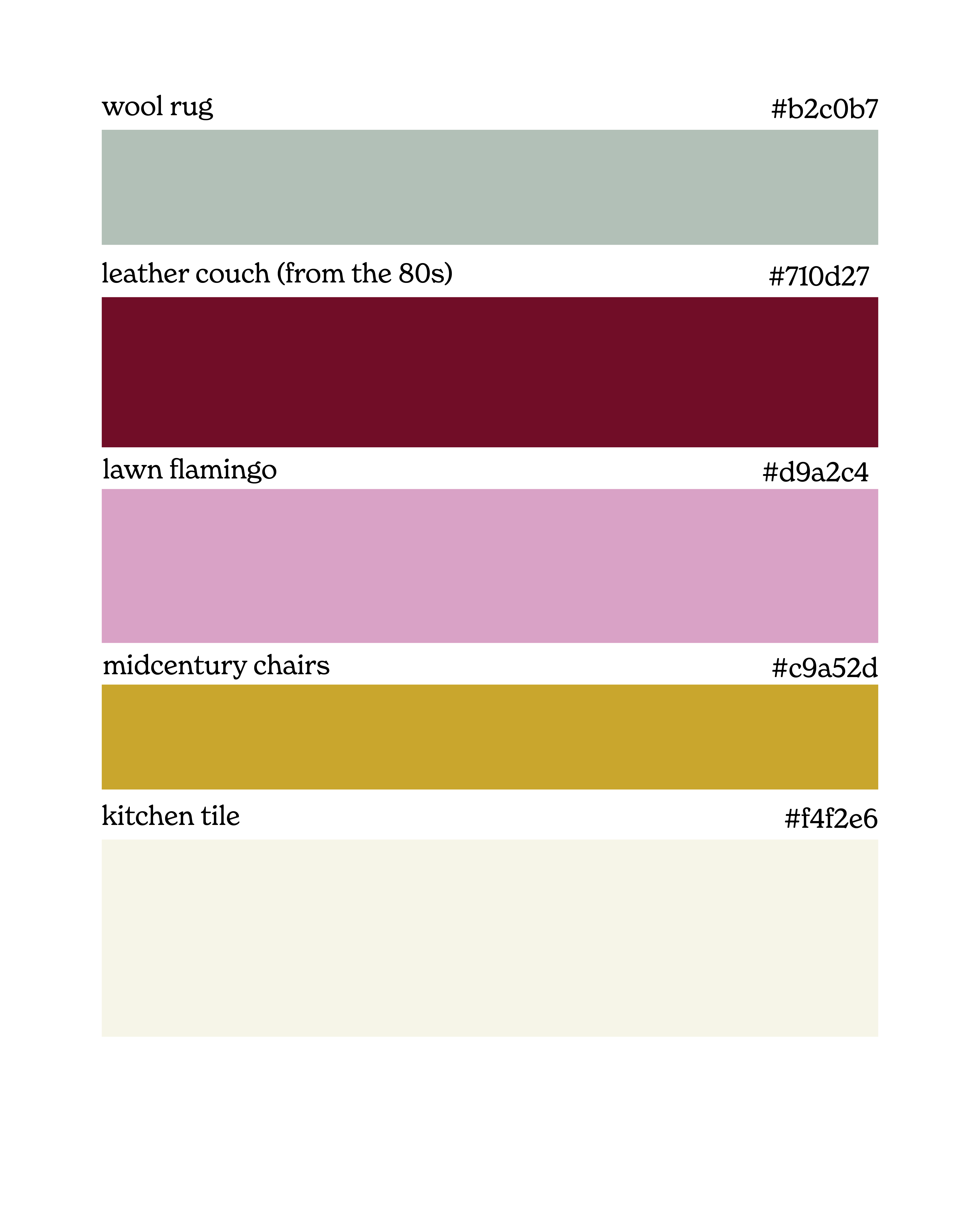
New Year’s Day:
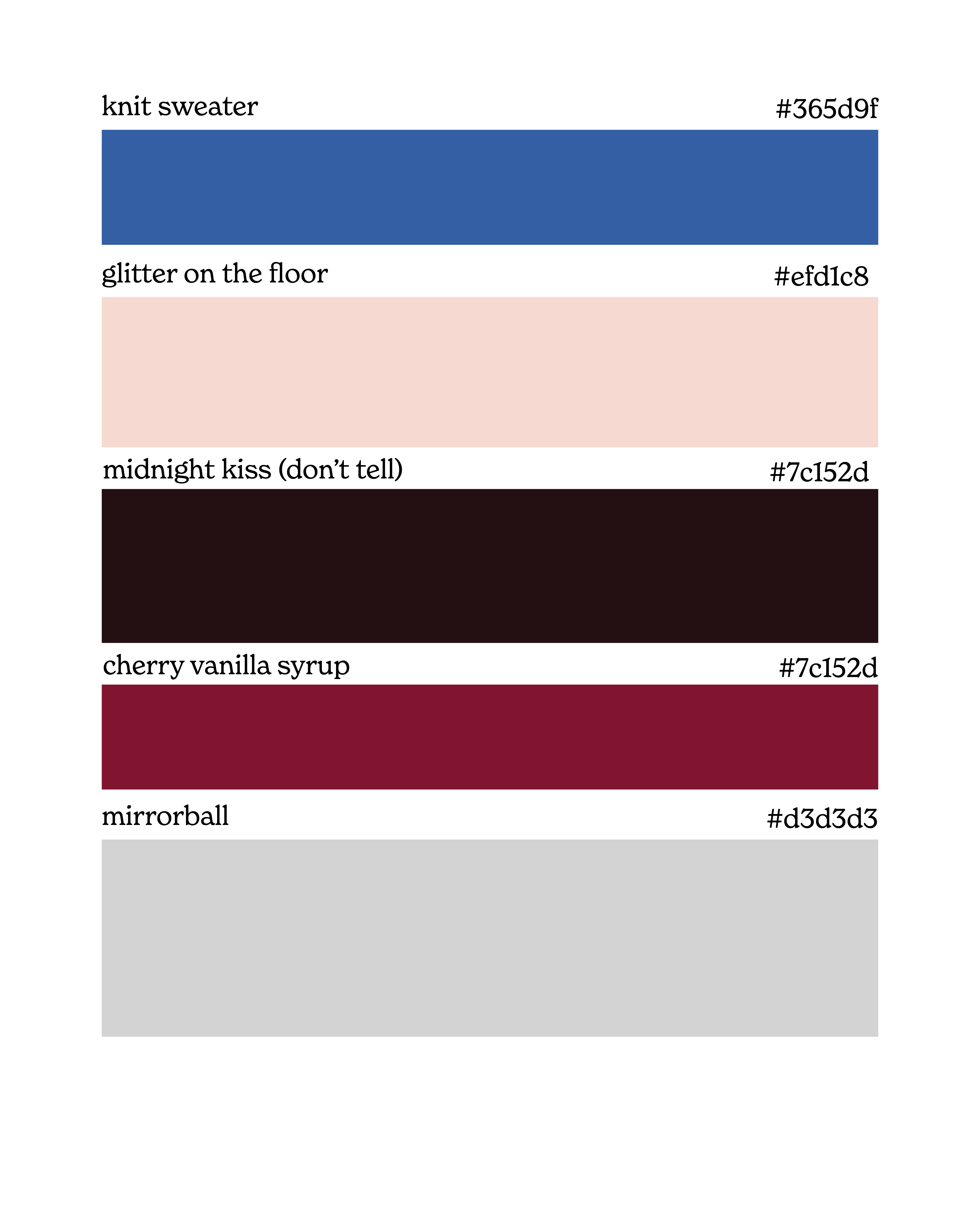
This palette was inspired by a New Year’s Day party, combining vibrant cobalt blue with lush raspberry tones and a pop of grey-silver.
Obviously, I really want these chairs.
The combination of plush raspberry on the rug with the blue couch is perfection.
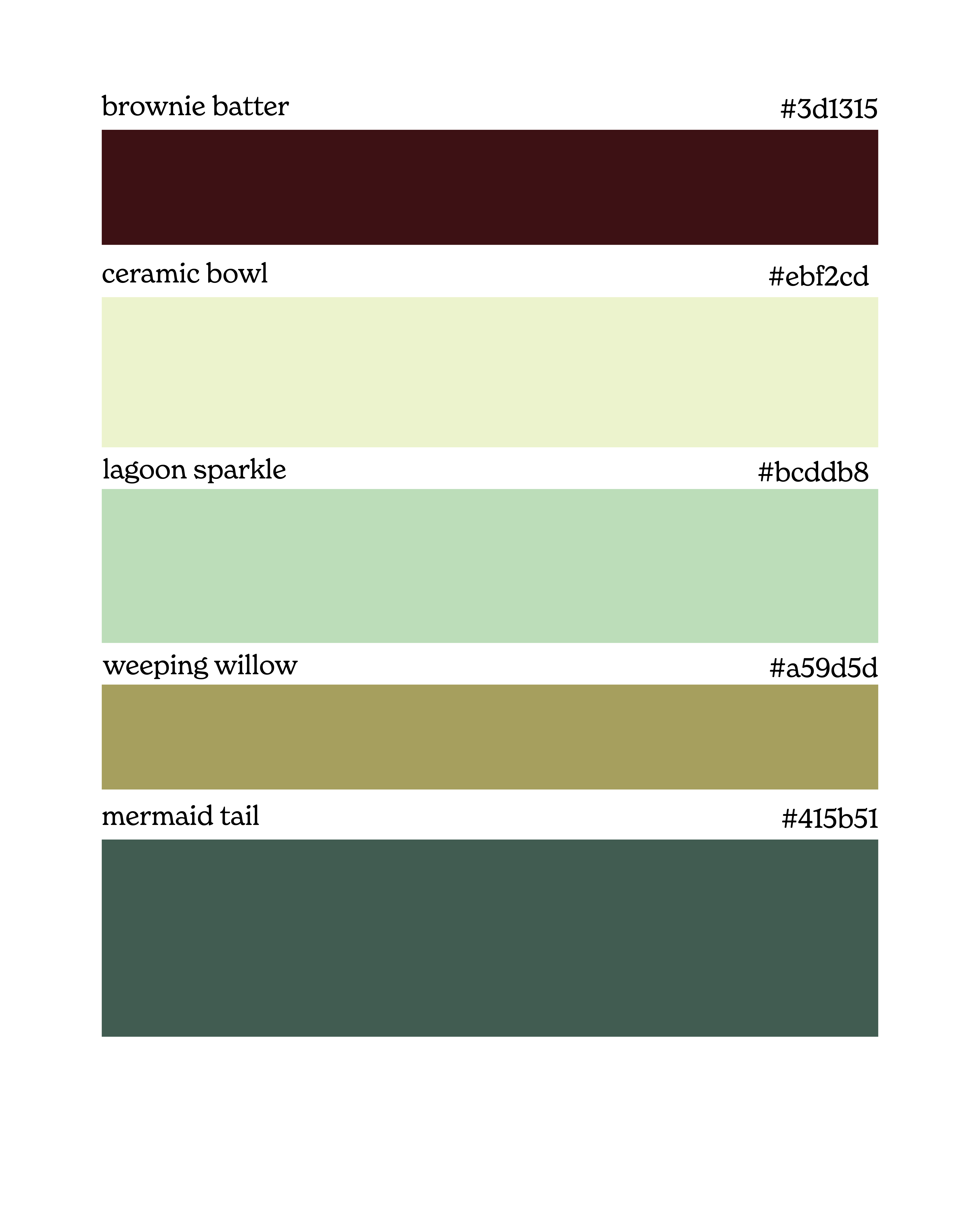
Retro Dinner Party:
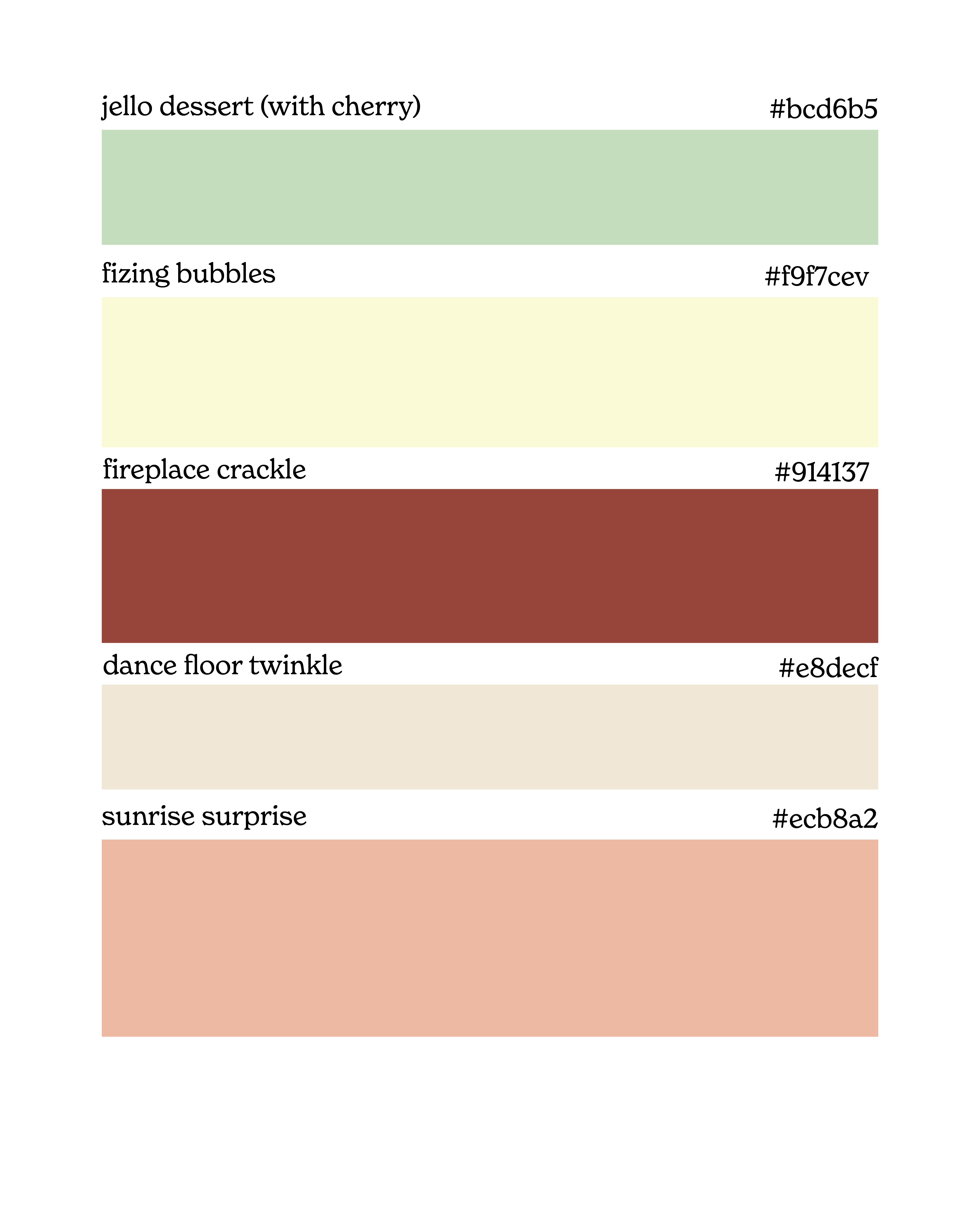
This palette is inspired by weird cookbooks from the seventies with Jell-O pudding, etc. I imagine it as a party that went a little too late in someone’s midcentury ranch home.
This palette in a kitchen is such a tasteful way to do color if bold colors intimidate you.
New Hometown:
This palette is inspired by the feeling of being home — truly settling in a place and enjoying it. Even the idea of becoming a “local” at a nearby coffee shop.
I gasped when I saw this throw that is nearly the exact palette, and now I need to hunt to find it so I can wrap it around myself.
Summer Holiday:
This palette is inspired by my summers at Anna Maria Island, Florida. The beach is one of my favorite places, especially because the vibrant colors that fill beach towns.
Bethany Brill’s colorful home has always dazzled me. She combines bold colors so tastefully and skillfully.
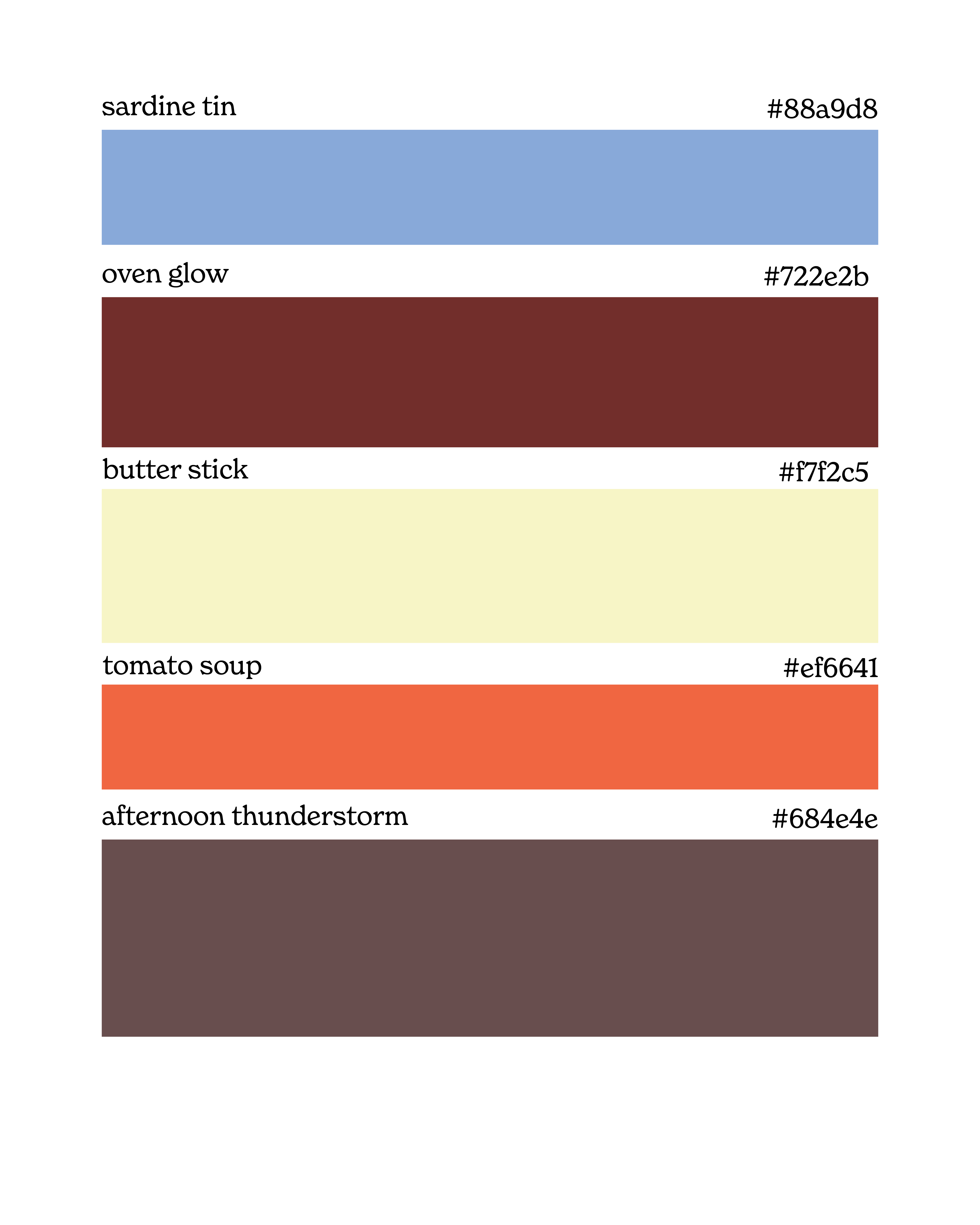
Storm Clouds:
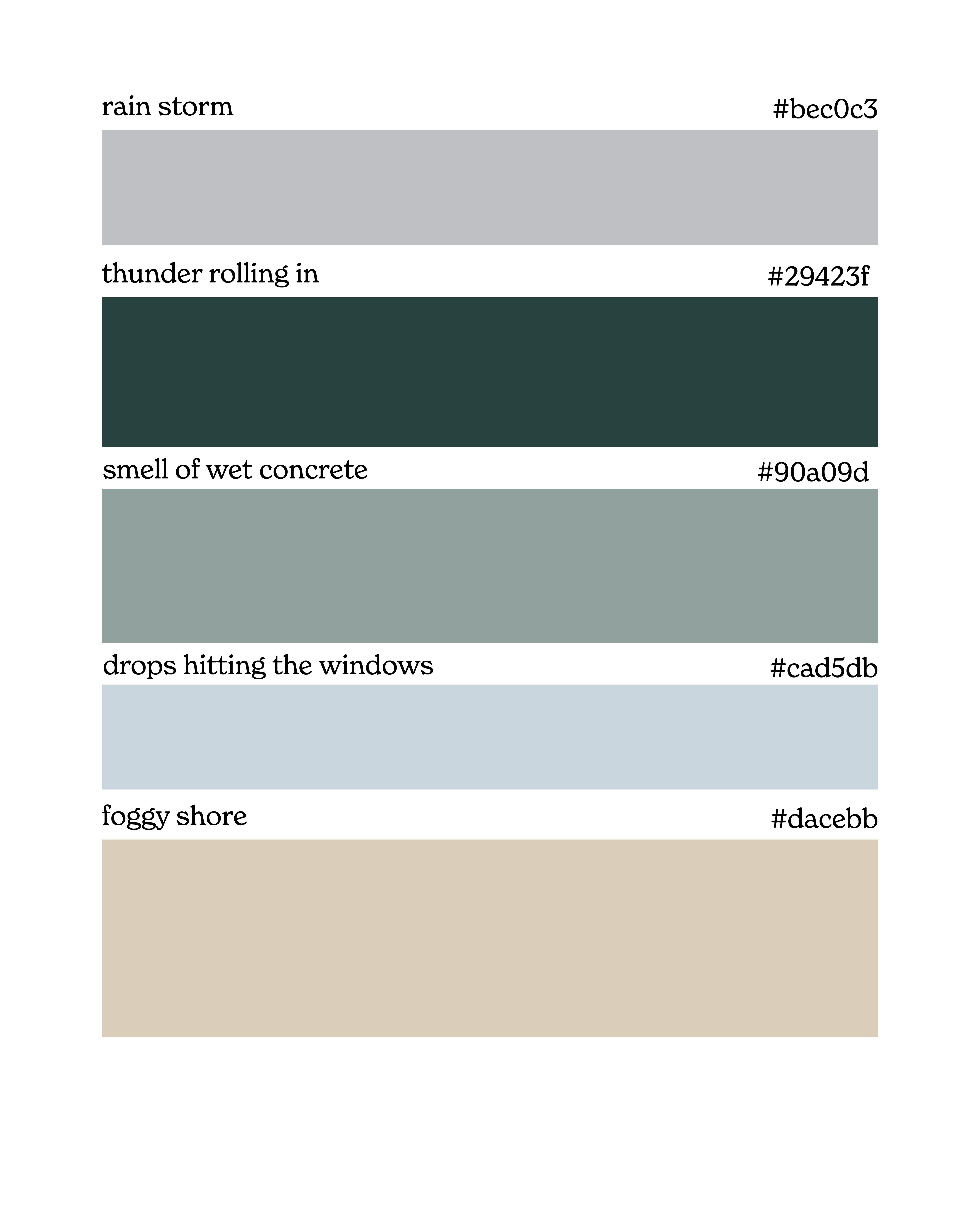
This palette is inspired by a cozy rainy day at home. You know when it starts drizzling around dinner time, and you know you are going to have a very cozy night? That’s what I tried to capture.
A room drenched in a color is a room I really like.
More grey-blue hues mingling.
Fairytale:
This palette was inspired by Never Land, from Peter Pan. I love the idea that we can use stories that mean something to us as design inspiration for our spaces.
This feels lagoon-y, does it not?
I love this monochromatic look.
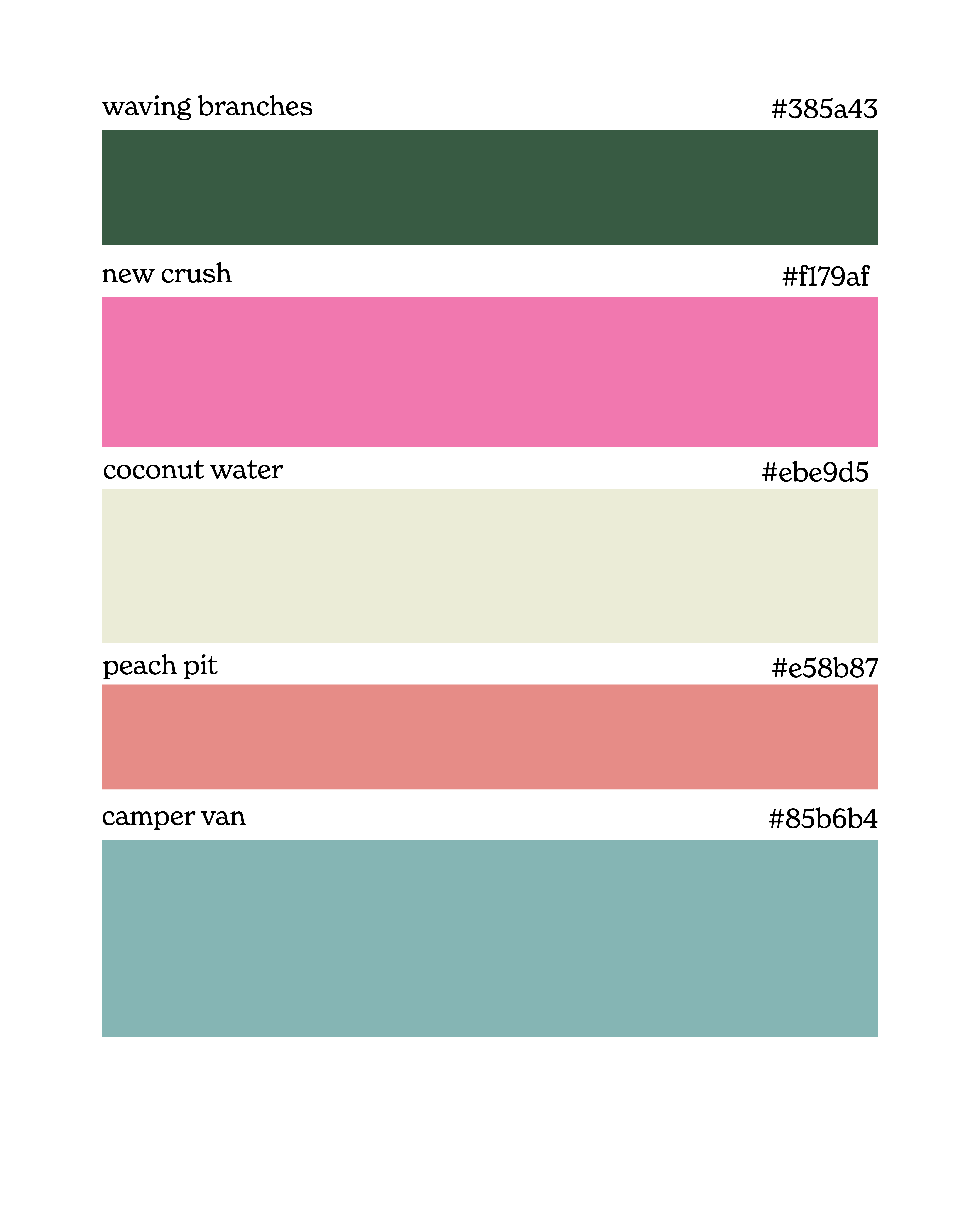
Greenhouse:
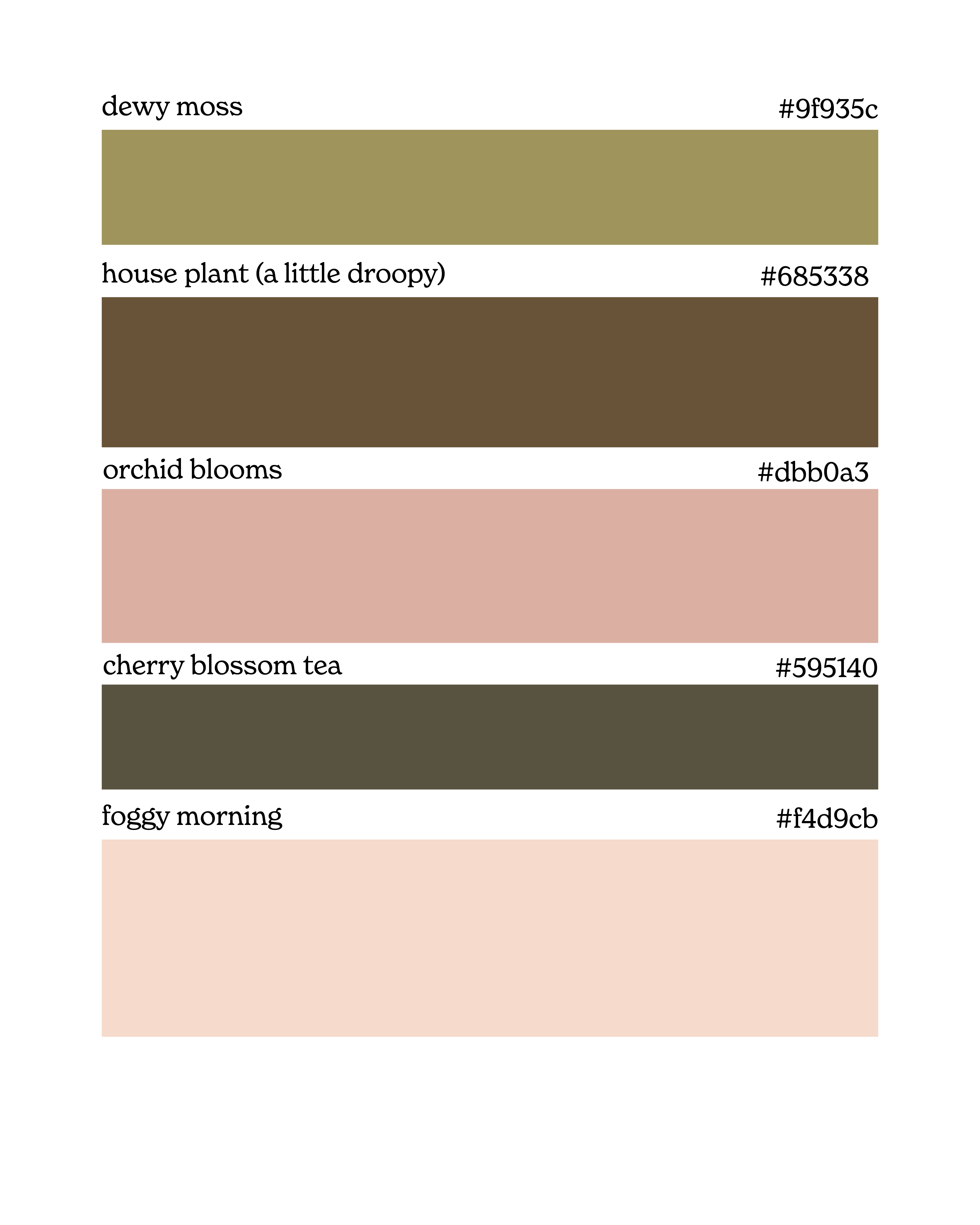
This palette is inspired by my favorite greenhouse I used to go to during college to buy succulents for my dorm. The owner could grow the most beautiful orchids.
Pinks and greens forever!
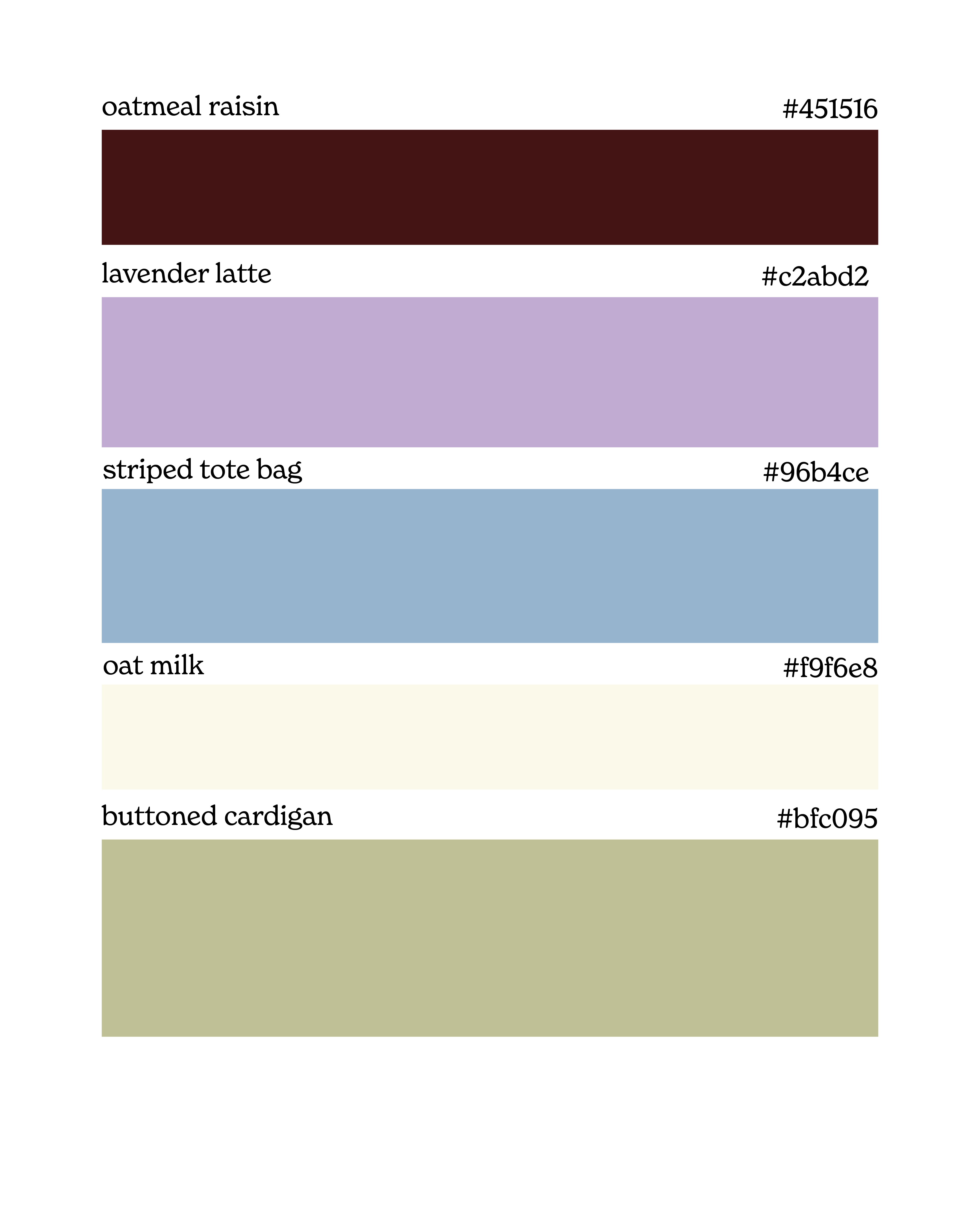
Midcentury Dream:
This palette was inspired by midcentury home design. I made it after touring a midcentury home for an editorial piece.
Moody colors make for beautiful spaces. Lately, I’ve been more drawn to moody colors than true colors — and I am surprising myself!
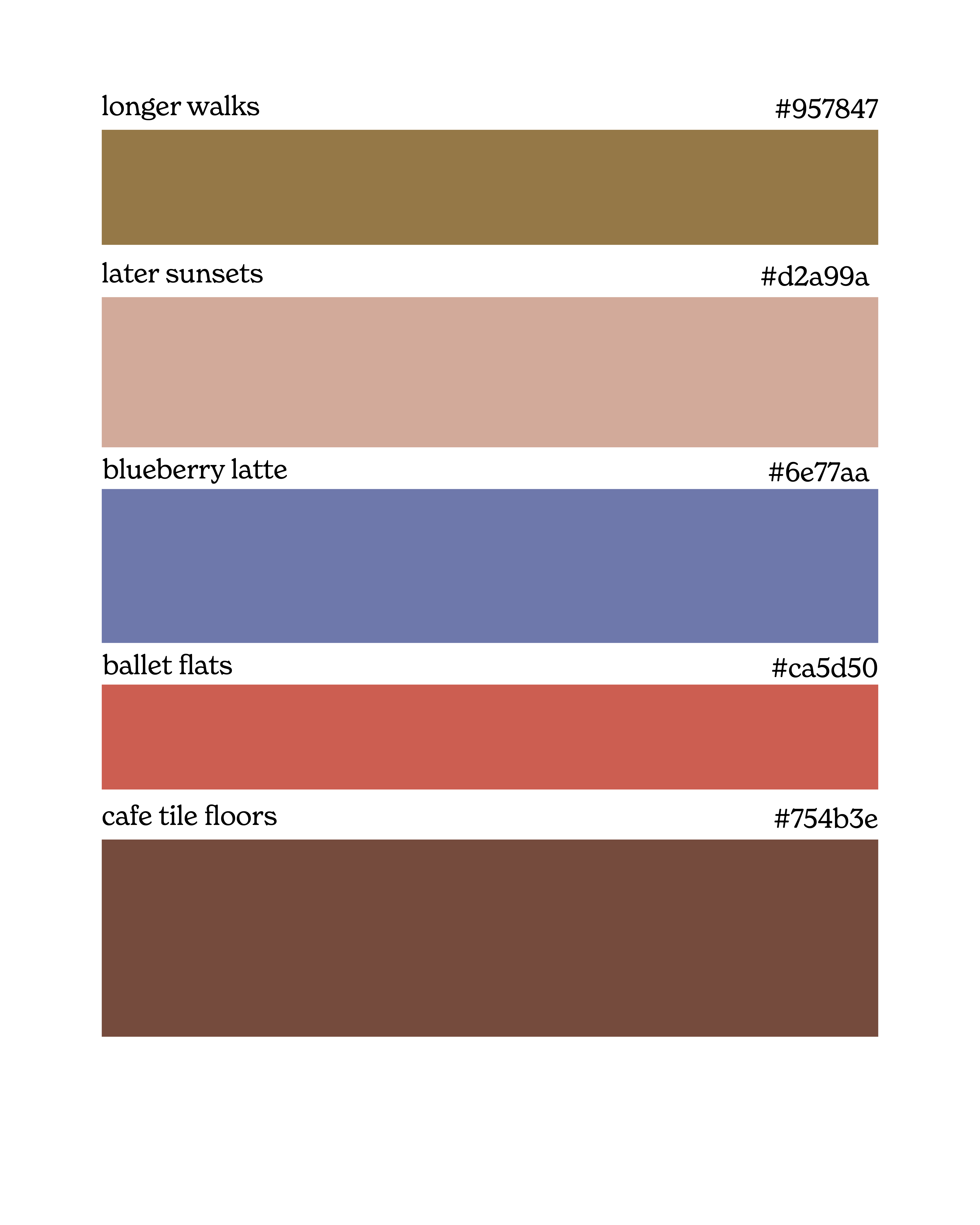
Best Friend’s House:
This palette is inspired by visiting my friend, who always offers me a coffee and a cookie. If you were to make a list of your favorite homes to visit, what colors stand out in that list?
Absolutely gorgeous use of velvet.
MORE READING:
Monochromatic Matcha & Striped Lava Lamps

Happy Monday! I am taking the week to finish up a really big Winter Edition of Feeling! so the regularly scheduled Monday Letter is on pause while we shift focus to dazzling, nostalgic graphics for the secret winter release.


🐚 Read more thoughtfully created articles here
🪄 Shop all my favorite things
🍒 Let’s be internet friends, please! @ jennaisfeeling
🪄 Get more inspiration
I loooove new hometown and the story to go along with it! This is inspiring me to think of color differently!!
Oh my goodness! Best Friend's House is so inspiring! My life goal is to [almost] always have baked goods ready for my guests :D My bestie does something similar; she usually has me pick a bag of tea from her tea collection so she can make me a mug :)
Also, this article was so helpful because I was pondering redecorating my home with more color, but I had no clue how to do it without making things look tacky! XD